Service
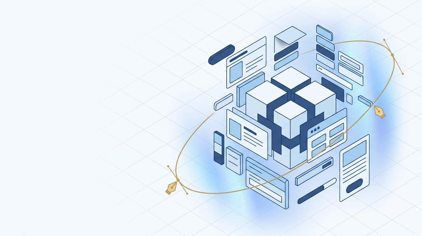
Product Design & Development
Research, design, and ship products people actually use
From concept to launch — we design and build data-driven digital products with intuitive UX and intelligent features.
Who we design for
B2B and B2C teams shipping revenue-critical digital products across global markets.
B2B SaaS
Complex tool UX, data-heavy dashboards, admin surfaces that do not buckle at scale.
Consumer Fintech
Onboarding, KYC, payments, and wealth flows optimized for conversion.
Digital Health
Patient-facing and clinician-facing apps designed for stress-state usability.
Public Digital Services
Citizen-first experiences that meet accessibility and plain-language standards.
EdTech
Learning platforms that balance engagement with pedagogy, K–12 through corporate.
Retail & Loyalty
Commerce flows, loyalty journeys, and brand-driven storefronts.
Double-diamond, with production discipline
We ship validated UI into a Storybook + Figma pipeline — not mood boards.
- 01
Discover
Jobs-to-be-done interviews, analytics triangulation, competitive teardown.
- 02
Design
Information architecture, interaction patterns, brand-aligned visual system.
- 03
Prototype
Mid- to high-fidelity prototypes wired to real data where possible.
- 04
Validate
Usability testing, A/B prioritization, accessibility audit; then developer handoff.
Design toolchain
Tooling that is production-integrated, not just pretty screens.
Research
- Maze
- Dovetail
- Hotjar
- User Interviews
- Amplitude
Design & Systems
- Figma
- FigJam
- Tokens Studio
- Style Dictionary
- Specify
Prototyping
- Framer
- Protopie
- Origami
- Rive
- Principle
Engineering Handoff
- Storybook
- Chromatic
- Figma Code Connect
- Ladle
- Playwright Component
Most digital products fail in the space between a promising brief and a shipped release — not because the idea was wrong, but because design decisions were made without evidence, engineering constraints were ignored in Figma, and the handoff was a ZIP file. We close that gap.
What does 'data-driven design' mean in practice?
It means no screen is drawn until we have signal: session recordings, drop-off funnels, support-ticket themes, or field interviews with real users in Bangkok, Jakarta, or Kuala Lumpur. Design choices — navigation depth, onboarding step count, LINE-based notification triggers — are argued from data, not opinion. When we revisit a decision post-launch, there is a record of why it was made.
How do you validate a product concept before engineering investment?
A two-week discovery sprint — stakeholder interviews, competitive audit, and a clickable Figma prototype tested with five to eight target users — surfaces the assumptions most likely to kill the product. We run these sprints before a single line of production code is committed, which typically saves four to twelve weeks of rework further down the timeline.
When should AI features be added — at launch or later?
Almost always later — but the data model and UX hooks need to be designed for it from day one. A search bar that will eventually become semantic search, a feed that will eventually be ranked by a recommendation model, a chatbot entry point that will eventually call an agentic workflow: these need anchor points in the architecture before launch, even if the AI layer activates in phase two. We design for that future state deliberately.
A design system that engineering can't consume is a mood board, not a product asset.
What we hand off to engineering
Handoff is where most agency-client relationships fall apart. We eliminate ambiguity by delivering a complete, living package that engineers, QA, and product managers can work from independently — without Slack clarification loops.
- Research plan and synthesis report — interview transcripts, affinity map, prioritised insight list
- Figma design system with bilingual (Thai–English) component variants and mobile-first breakpoints
- Design tokens exported as JSON — colour, typography, spacing, radius — ready for style-dictionary or direct CSS variable injection
- Component library in React or React Native with documented props, states, and slot patterns
- Interaction spec for LINE Mini App and deep-link flows — covering notification-triggered re-entry and KakaoTalk-style card message payloads where applicable
- Accessibility audit report — WCAG 2.1 AA pass/fail per component, with remediation notes for contrast ratios and touch-target sizing on budget Android devices
- Annotated prototype with edge-case flows — empty states, error handling, skeleton loading, and offline degradation
If you have a product brief, a legacy interface that needs a redesign, or an AI feature that needs a UX wrapper before it can go to users, talk to the HarmonyX product design team. We scope discovery workshops within a week and can be in the field with your users shortly after.
Outcomes we have moved the needle on
Measured pre/post across recent engagements.
median conversion lift on redesigned checkout flows
SUS usability score uplift in 1 quarter
accessibility baseline across shipped surfaces
developer handoff time with Code Connect + tokens
Have a product that feels heavier than it should?
We run a 2-week discovery sprint that pairs research, analytics, and design. Output: a prioritized experience roadmap with measurable hypotheses.